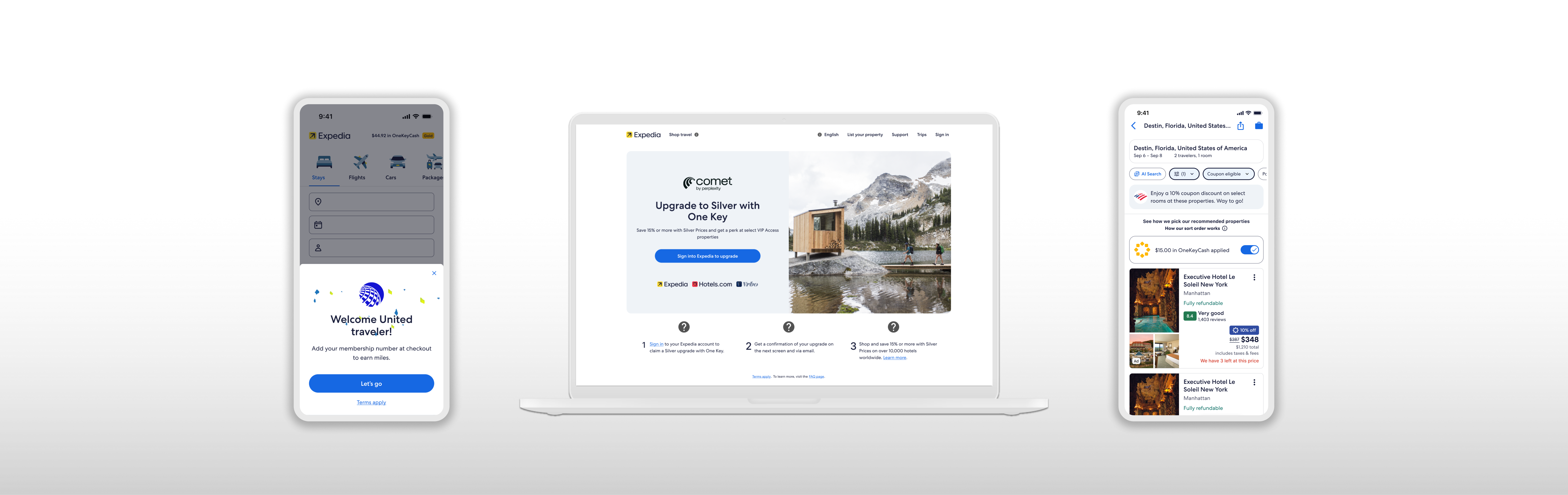
Expedia Group: Partnerships E-Commerce
Redesigned the end-to-end partnership shopping flow and launched campaign landing pages to grow users plus improve conversion.
Redesigned the end-to-end partnership shopping flow and launched campaign landing pages to grow users plus improve conversion.
Owned end-to-end flows introducing new UI patterns and standardizing 200+ deal-based initiatives to increase shopping conversion
Led Design alignment across Product, Content, Research, and Engineering
Designed AI website tool that cut partner landing page launch time by 80%
One way to gain new customers was to expand partner offerings/ My challenge was to convert an event booker from Ticketmaster into an Expedia trip booking. This contract was positioned to yield $4M in bookings during 2026.
Untapped customer base, new and existing, for those who are traveling for events.
After booking events, attendees have to find a hotel in a manner disconnected from their event.
I designed the first iteration when the contract timeline showed we had just one quarter to deliver. But contracting extended the timeline 3 quarters, bringing further capacity and iterations.
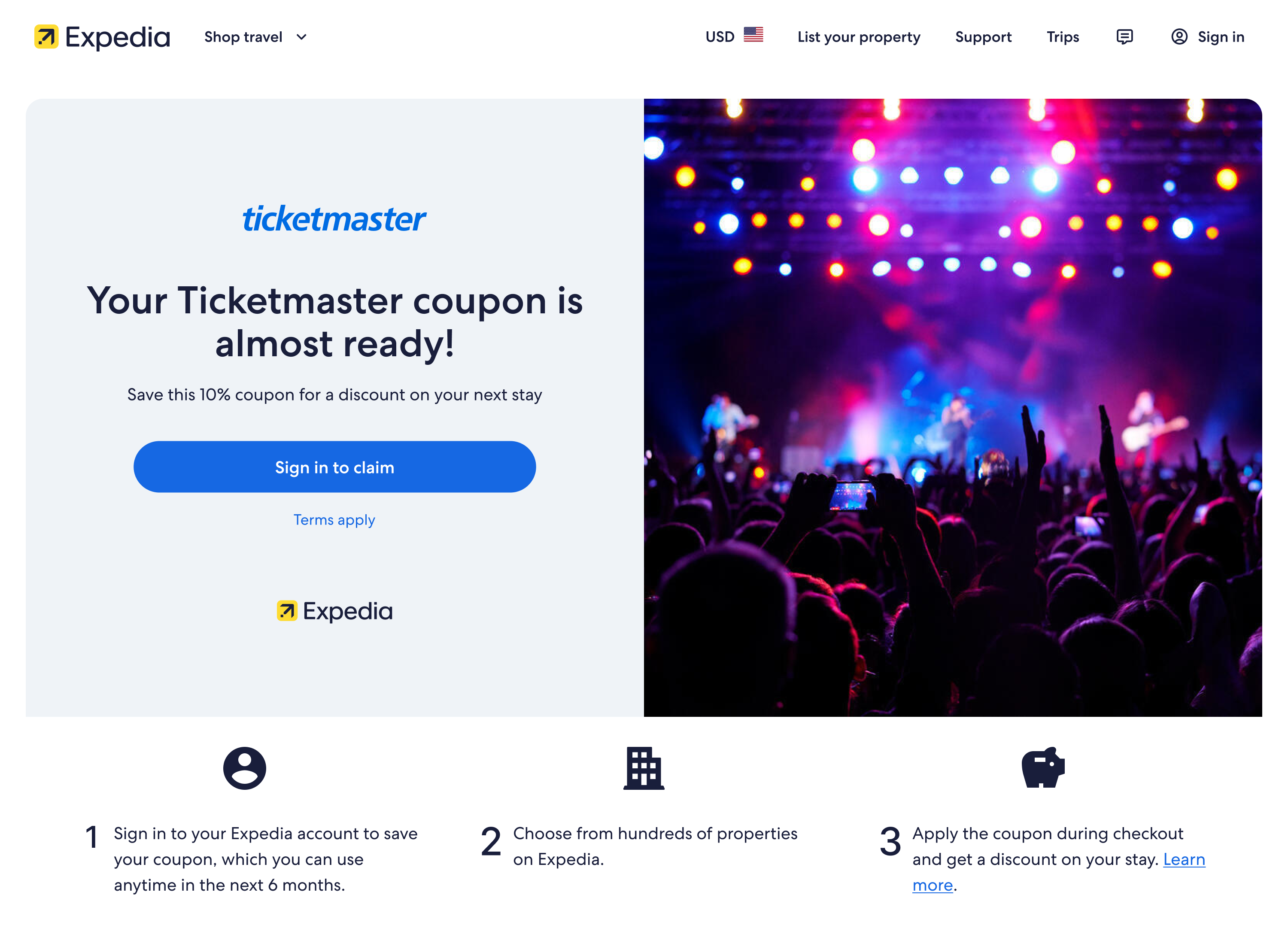
Focused on fast production with baseline deal clarity and search prominence
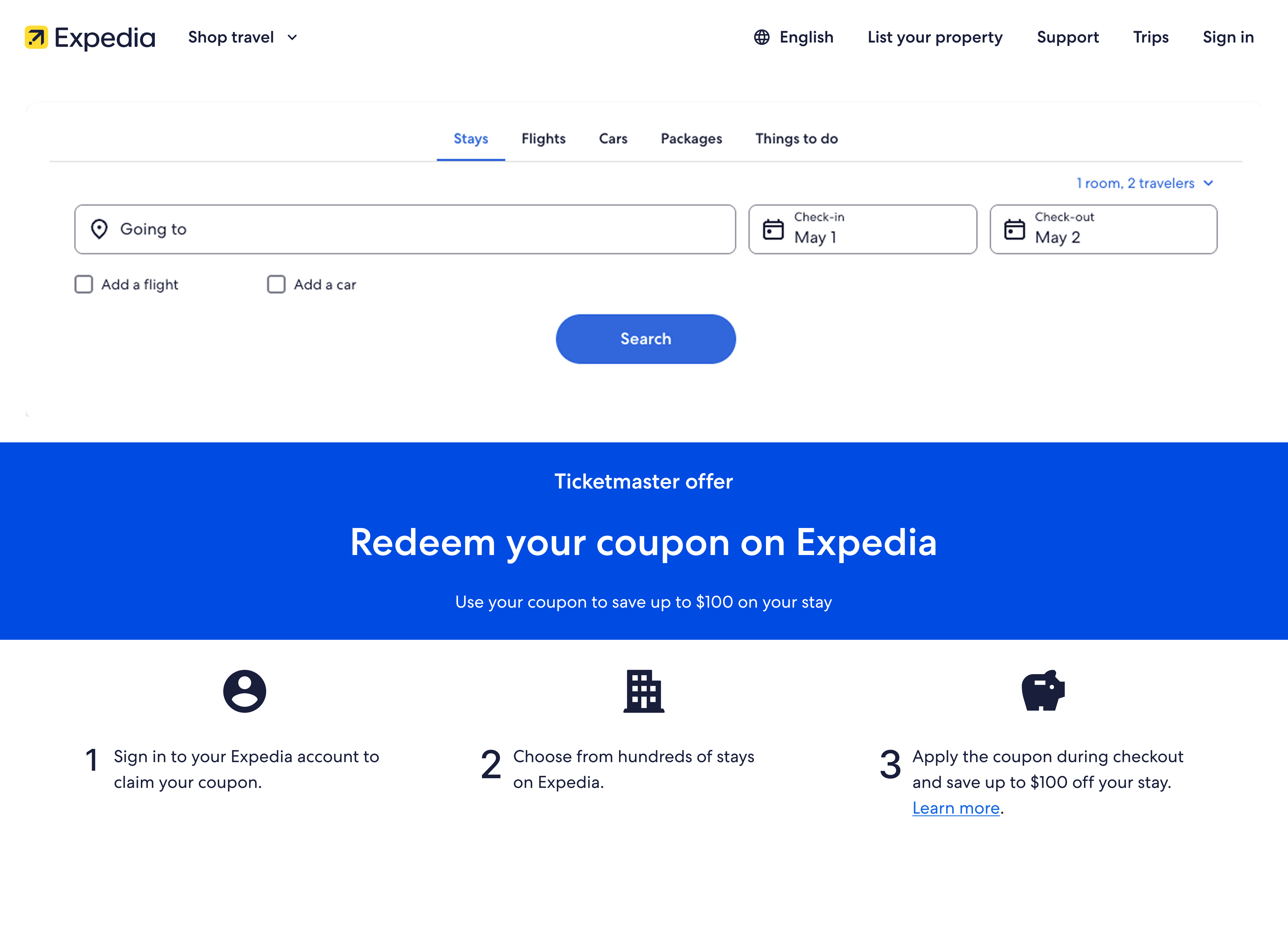
Improved visual design to increase intent of travel booking with savings
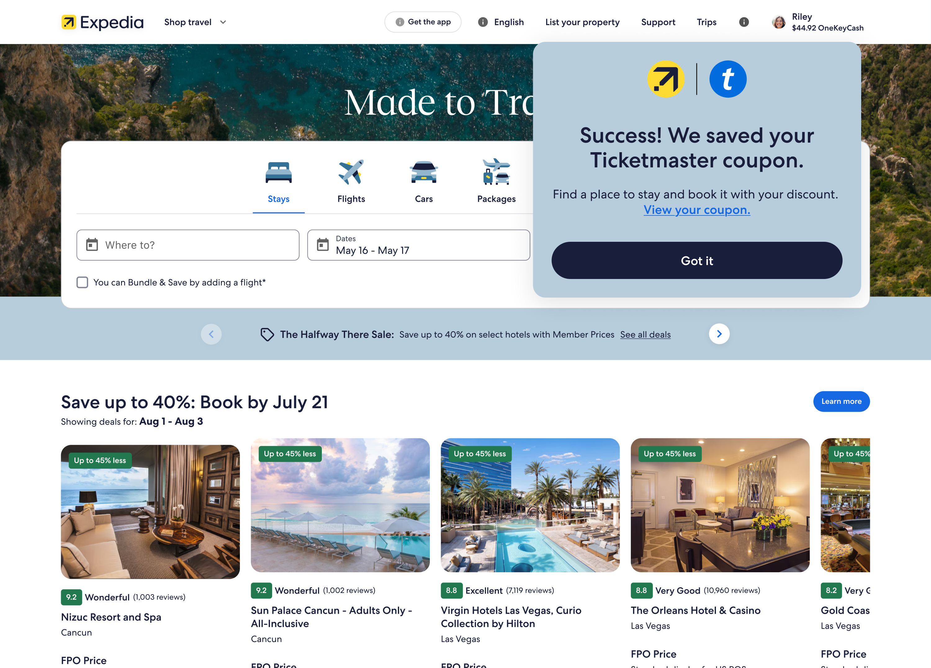
Seamless integration with Home page where search is optimal, without intermediary page
Expedia Group (EG) partnered with Perplexity and Condé Nast's paid subscriber groups to extend travel offerings to partners' respective programs. This brings travel discounts and perks to partners' traffic. Reciprocally, EG gains users.
EG wanted One Key members to engage with partners beyond a one-time booking.
Customers of partner brands found higher EG loyalty tiers unfamiliar or difficult to attain.
I created landing experiences that informed and excited users from partner traffic about the Expedia loyalty upgrades.
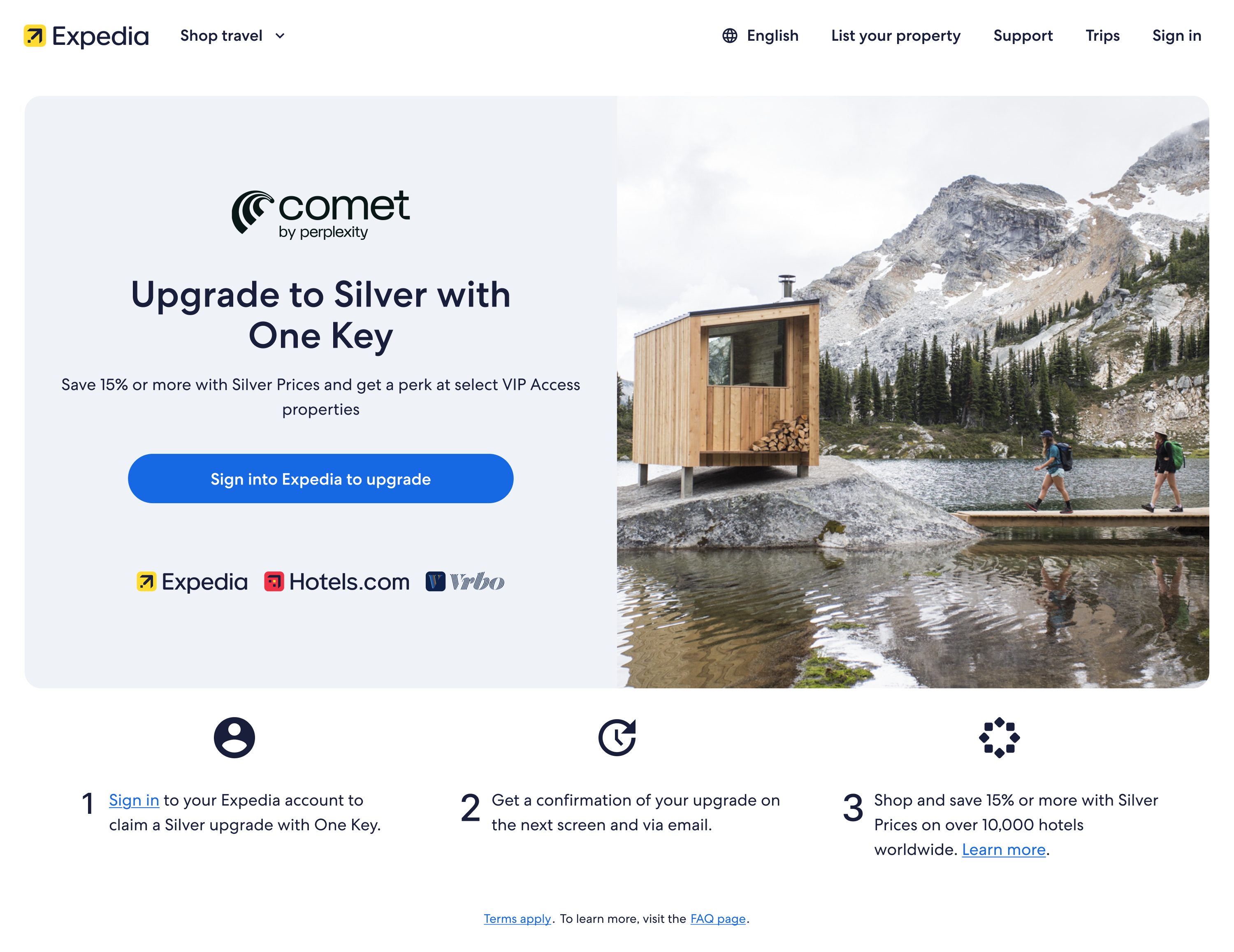
Partner-specific campaigns generated high revenue and branding impact! Yet EG needed more landing pages that could be easily scaled, and disparate campaign experiences were lowering traveler trust in consistency and quality. We looked at the problem in 2 ways: scalable design patterns and AI-assisted processes.
Without scaled, tested patterns, landing pages are effortful to create but not very performant.
Inconsistent landing pages across 200+ partners lowers trust at a critical moment in the funnel.
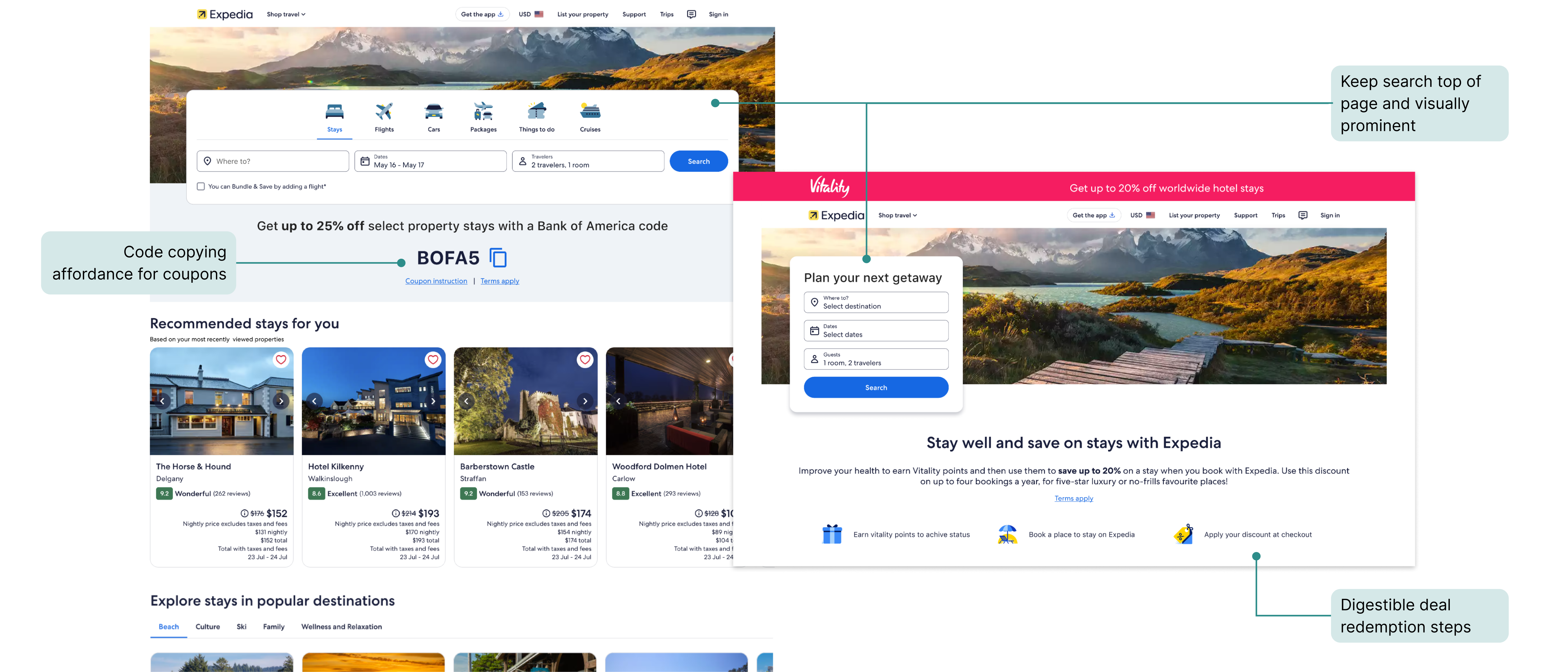
Today's landing pages are visually inconsistent and convert suboptimally. I refined the visual identity and restructured the information hierarchy of web landing pages for coupon and cashback partners.
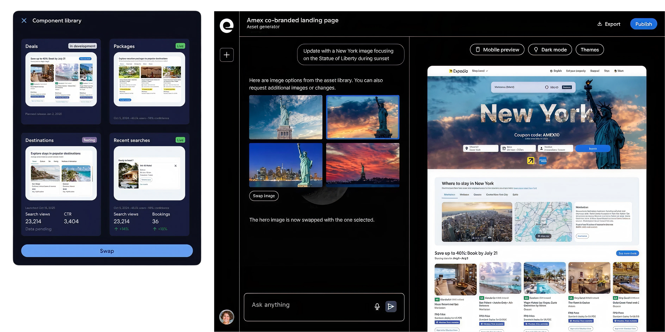
Even with templates, it was still a slow, manual process for Account Manager and Business Development teams to launch landing pages. During a multi-day hackathon, my team launched an AI tool to expedite landing page creation by an estimated 80%.
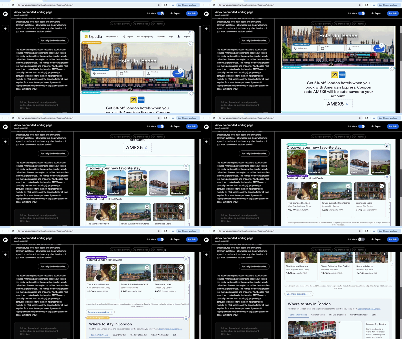
A business user can add in brand assets and edit campaign details to launch publishable landing pages in minutes!
I designed the end-to-end flow for discount-minded travelers coming externally onto Expedia. The focus is conversion, with solutions scaling across app, web, and mweb. The flow needs to instill confidence and delight about the offer.
EG saw high drop-off in the shopping flow for deal-savvy travelers.
Travelers lack the confidence, context, and delight of deal continuity from partner sources.
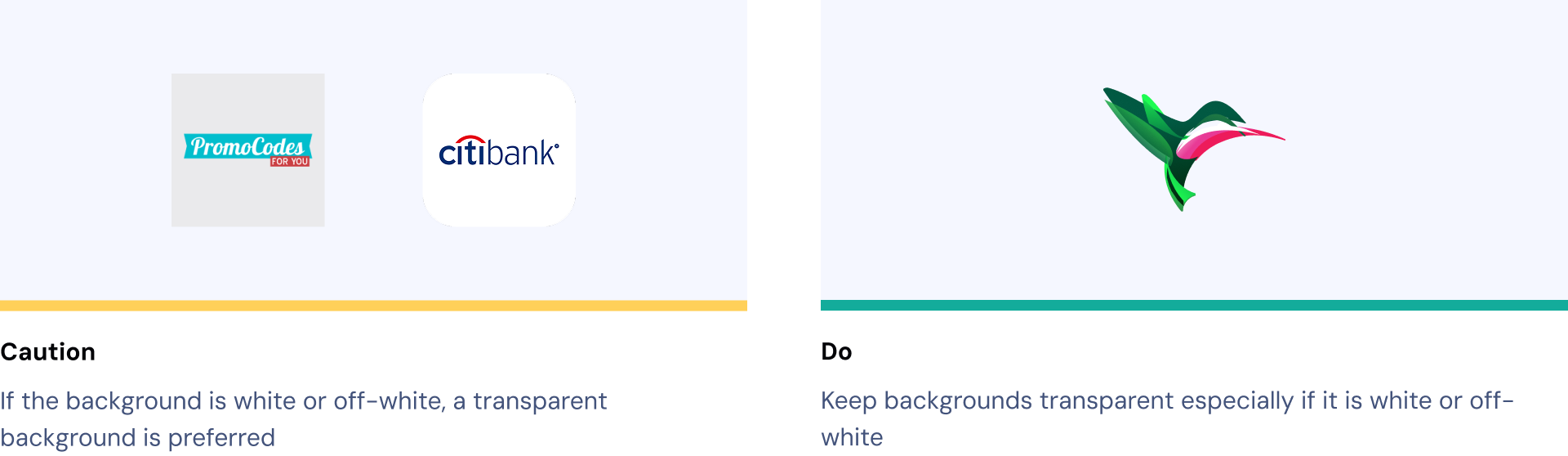
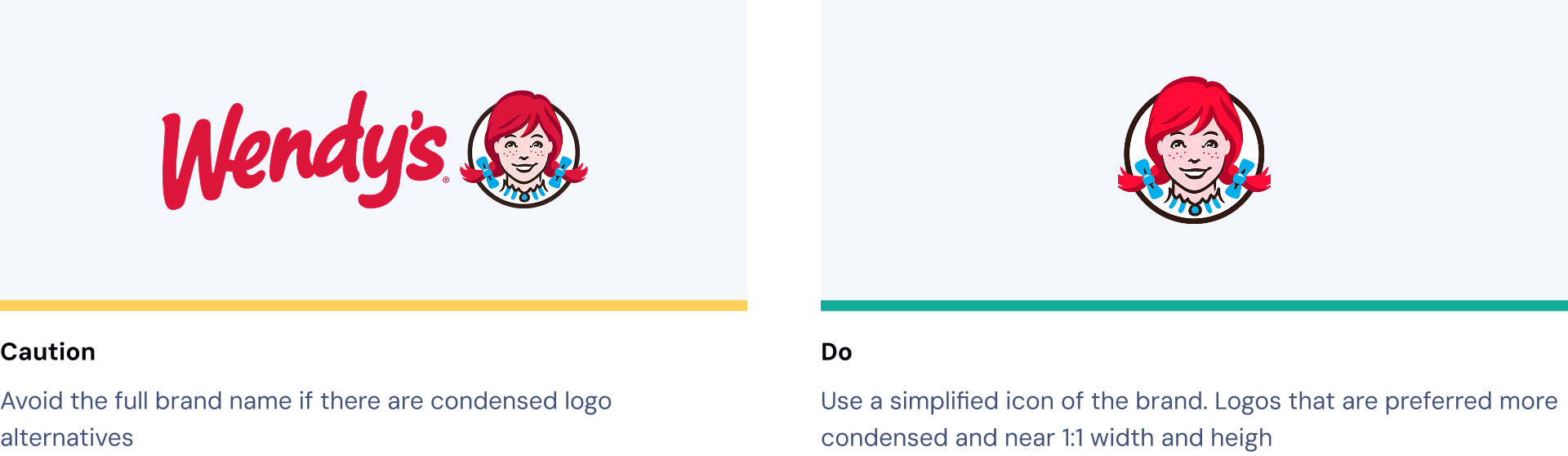
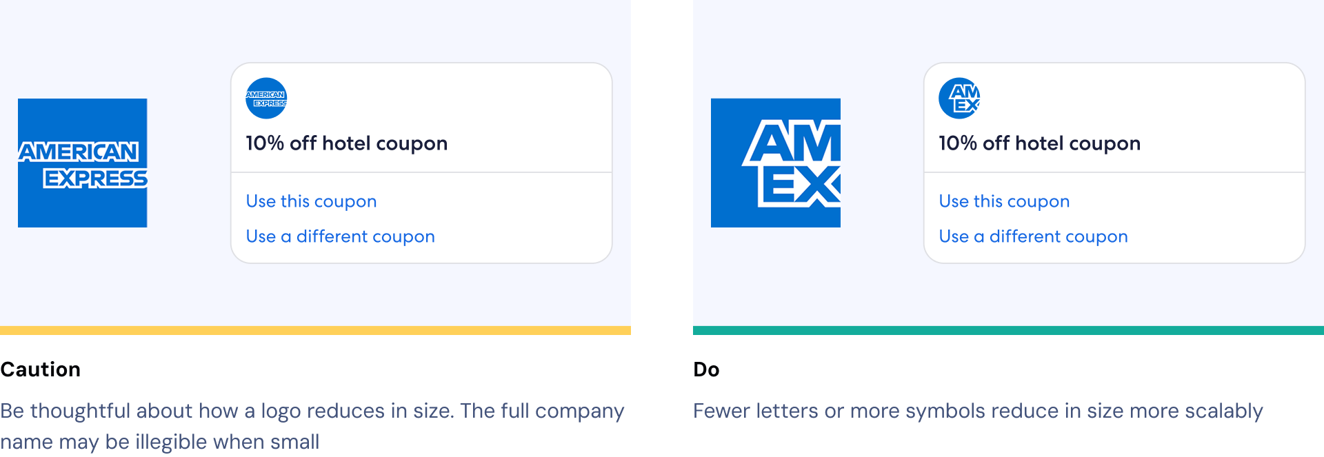
We collaborated with 200+ partners across travel, banking, and retail. Supporting that scale meant setting clear icon and logo submission guidelines, so partner branding stayed consistent and legible everywhere it appeared.
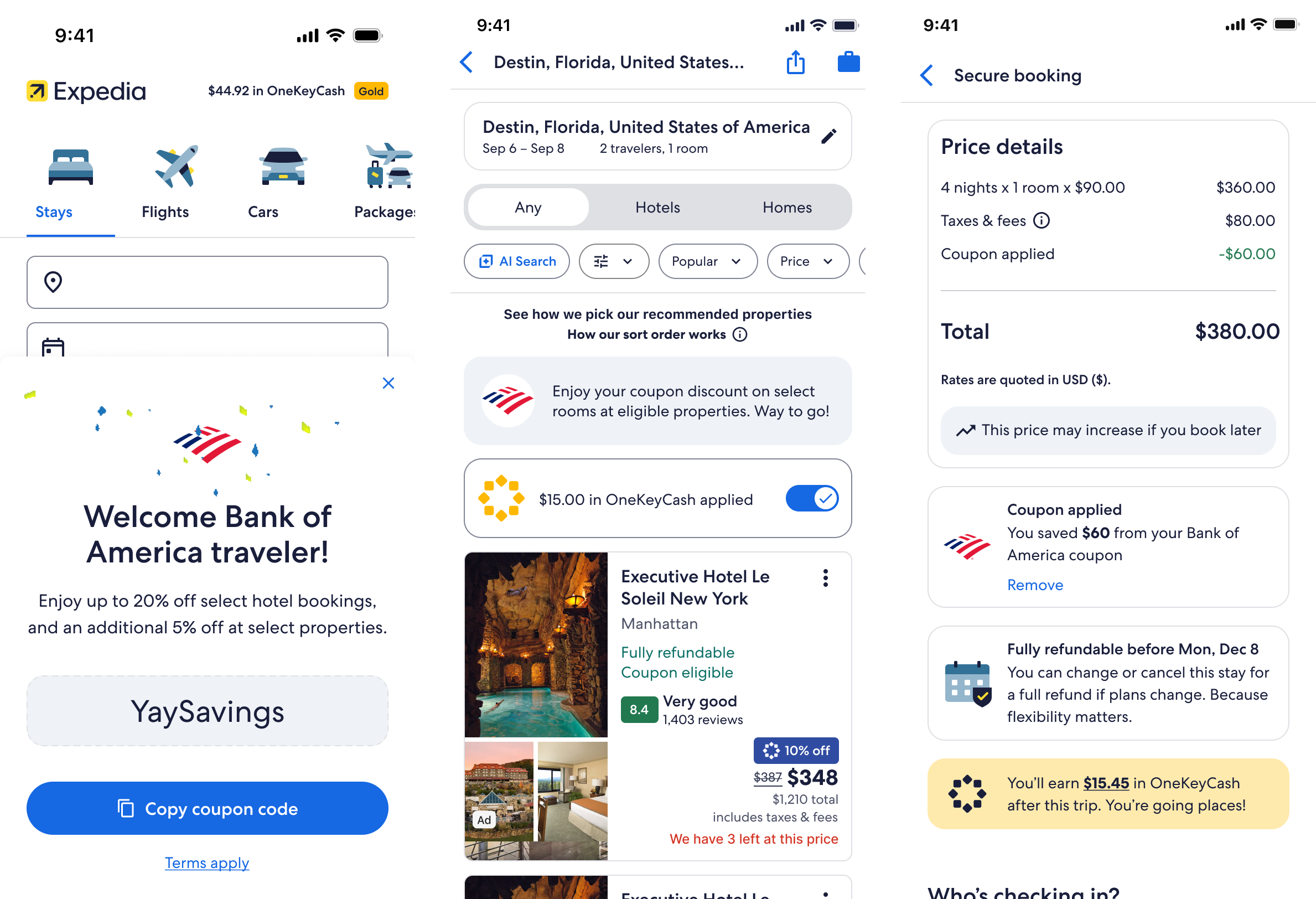
Before, travelers landed from a partner page (e.g. Bank of America) onto Expedia with no additional context, speculating their deal will apply. Adding reassurance visuals across key shopping touchpoints ultimately tested a 2% conversion gain.
I invested time in sharing iterative designs that intersect domains like Home, Shopping, and Checkout. Persistant alignment was made all worthwhile at product launch.
This apparently simple flow also came with nuanced business and legal logic. For instance, travelers cannot use both cashback and coupons in the same purchase.
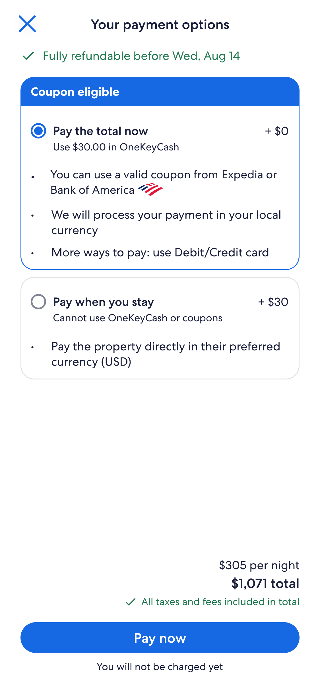
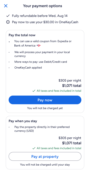
A future intiaitive proposed: travelers who spend more can save more. This encourages travelers to book higher value rooms or extend stays, which generates more revenue for Expedia. The traveler unlocks higher saving tiers.
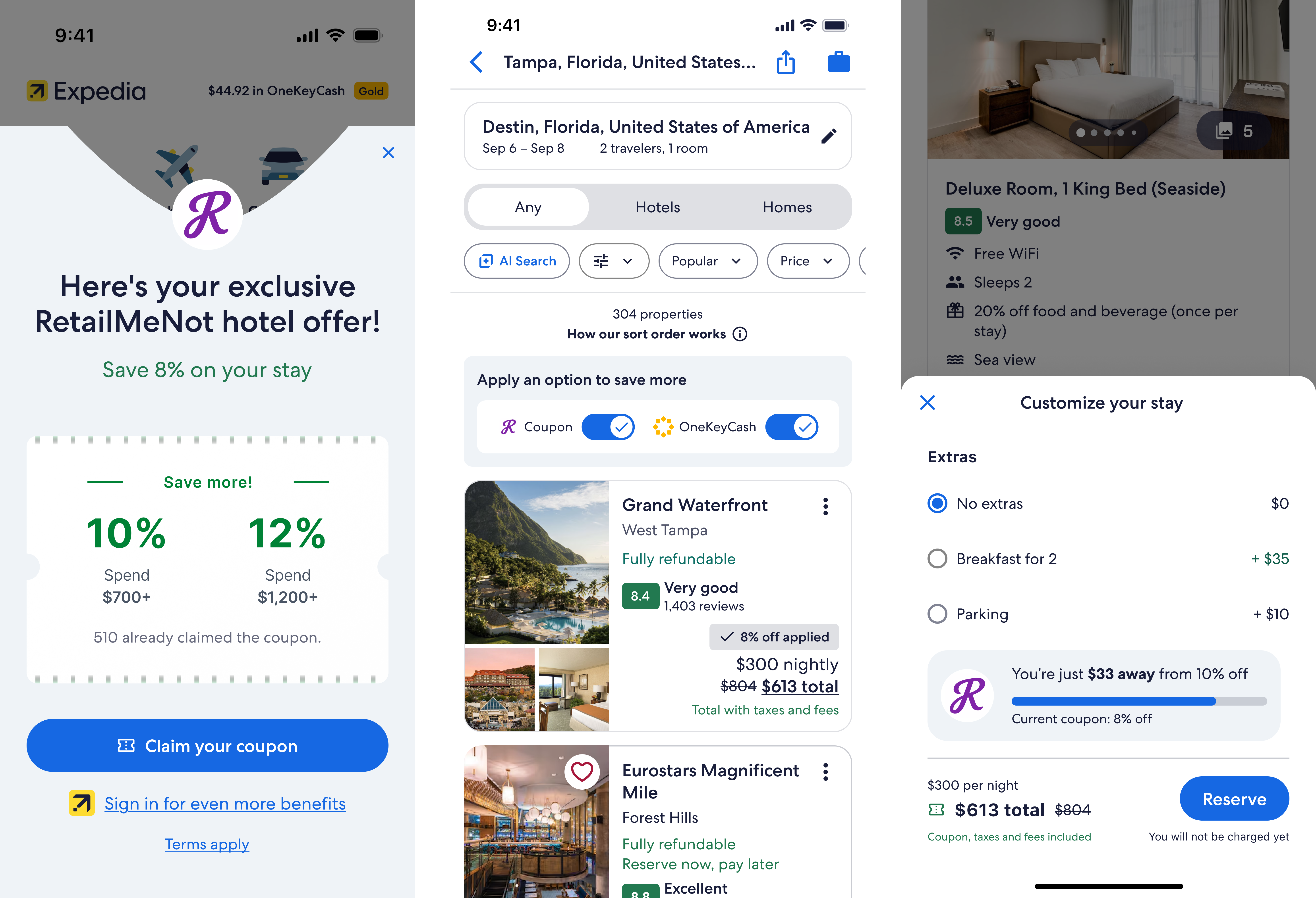
I pushed the visual design boundaries, presenting bold new concepts to gamify delight of coupons discovery and redemption. AI tools enabled more high-fidelity and complex experiences. Figma Make and Google Gemini for graphics. Adobe Firefly for animation.
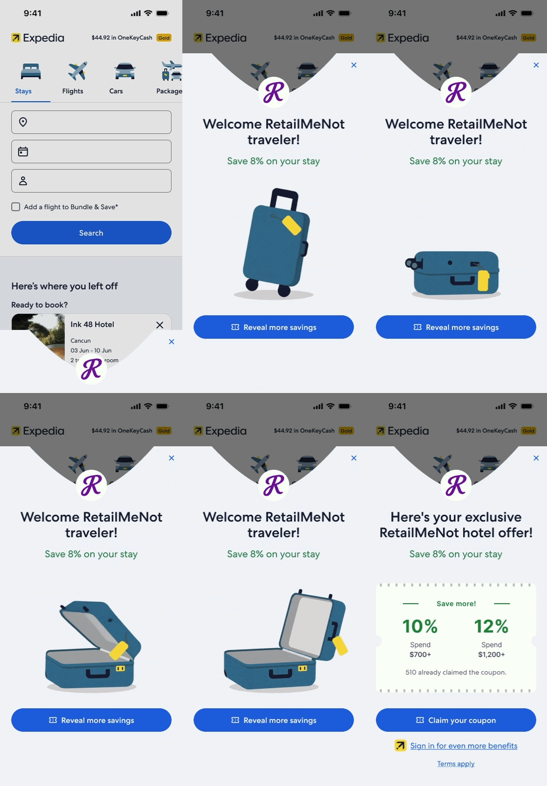
Regular sharing of video demos and offline follow-up helped our team get on contingency teams' priority lists
Flexible design set with features adjusting to release timeline against engineering estimations
Until a contract is signed, timelines and priorities can evolve, so design with agility
Investing in lean AI solutions is a way for our team to redirect time on more impactful tasks